
CSS3 : 簡單使用flexbox 展示自適應及滑過效果
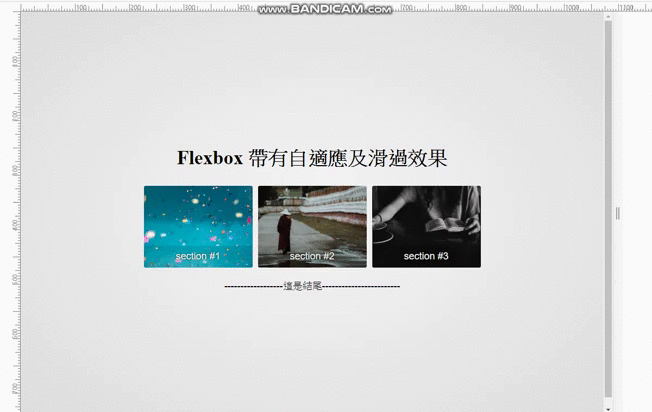
 首先,我們先看想呈現的效果。
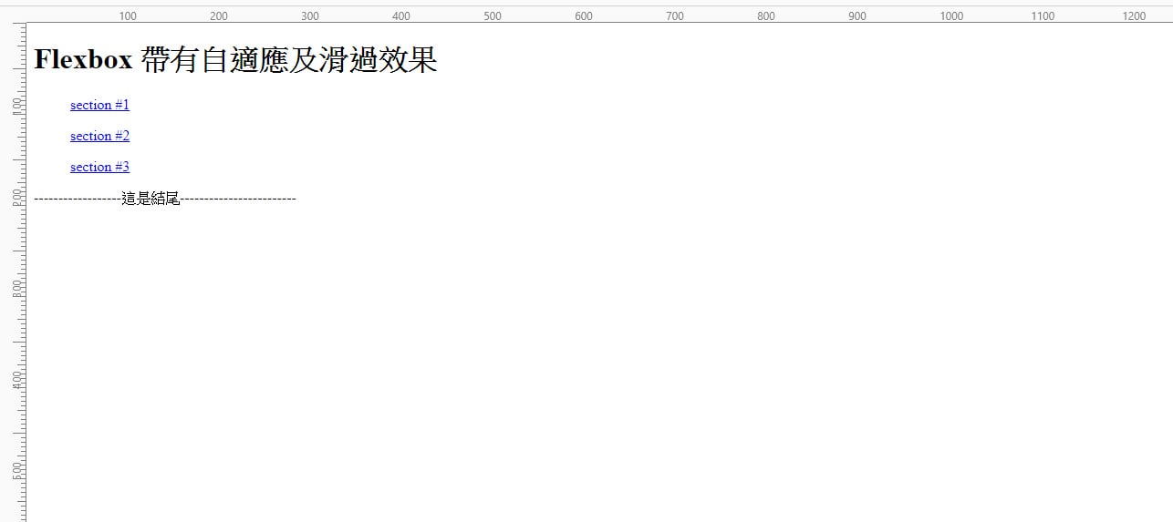
我們先建立基本的html:
<body>

  <main>

       <h1>Flexbox 帶有自適應及滑過效果</h1>

       <section class="gallery-grid flex">

           <a href="#" class="flex-item">

               <figure class="item1">

                   <figcaption>section #1</figcaption>

               </figure>

           </a>

           <a href="#" class="flex-item">

               <figure class="item2">

                   <figcaption>section #2</figcaption>

               </figure>

           </a>

           <a href="#" class="flex-item">

               <figure class="item3">

                   <figcaption>section #3</figcaption>

               </figure>

           </a>

       </section>

       <p>------------------這是結尾------------------------</p>

   </main>

</body>
呈現如下:
加上最基本的css設定:
(以下的3個背景圖片位置在本機,如要看到效果可以自行下載喜歡的圖片測試,推薦 unsplash )
* {

  box-sizing: border-box

}

html {

  height: 100%;

  font-size: 62.5%;

}

body {

  height: 100%;

  display: flex;

  align-items: center;

  justify-content: center;

  text-align: center;

  font-family: "Source Sans Pro", sans-serif;

  font-size: 1.8rem;

  background: radial-gradient(ellipse at center, #f5f5f5 0%,#ddd 100%);

}

a {

  color: #333;

   text-decoration: none;

}

h1 {

   font-family: Merriweather, serif;

}

.gallery-grid figure.item1 {

   background: url(../img/jason-leung-479251-unsplash.jpg) no-repeat center;

   background-size: cover

}

.gallery-grid figure.item2 {

   background: url(../img/journey-man-1348682-unsplash.jpg) no-repeat center;

   background-size: cover

}

.gallery-grid figure.item3 {

   background: url(../img/priscilla-du-preez-607182-unsplash.jpg) no-repeat center;

   background-size: cover

}
呈現如下:
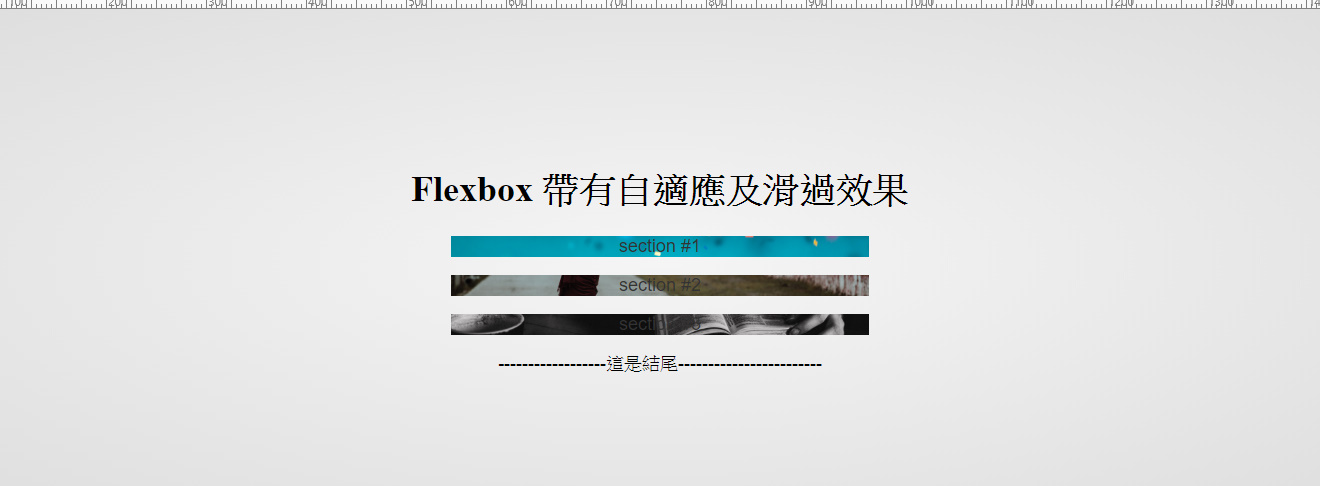
接下來加入的 css 讓gallery定位出來:
其中讓整個gallery 可以有自適應效果為紅字的
flex-wrap: wrap;(這讓寬度不夠時,裡面的元件會往下換行)
min-width: 200px;(這表示當元件寬度不足200時,進行換行)
.flex {

  display: flex;

   flex-direction: row;

   flex-wrap: wrap;

   justify-content: space-around;

   align-items: stretch;

   align-content: stretch}

.flex-item {

   flex: 1 0 auto

}

.gallery-grid figure {

   position: relative;

   min-width: 200px;

   height: 150px;

   margin: 5px;

   border-radius: 3px;

   box-shadow: inset 0 -40px 0 0 rgba(0,0,0,.1);

}

.gallery-grid figcaption {

  position: absolute;

   width: 100%;

   text-align: center;

   color: #f4f4f4;

   text-shadow: 0 0 3px #000;

   bottom: 10px;

}
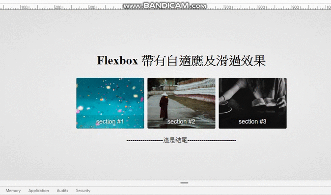
到這裡已經完成自適應效果了,呈現如下:
接著我們來完成滑入效果:
其中這個範例中figcaption的效果是用box-shadow達成,非偽元素。
在CSS中加入以下:
.gallery-grid figure:hover {

   box-shadow: inset 0 -150px 0 0 rgba(0,0,0,.5);

}

.gallery-grid figure:hover figcaption {

   bottom: 60px

}

.gallery-grid figcaption {

  transition: all .2s ease-in-out

}

.gallery-grid figure {

  box-shadow: inset 0 -40px 0 0 rgba(0,0,0,.1);

}
以上就是我們這次對於flexbox 的介紹,如果有其他想暸解認識的電商、網站相關主題,都歡迎留言讓我們知道,或者需要相關服務,歐斯瑞團隊將非常樂意替您解決!即完成過度效果了喔!


我要留言